ORA TRAILS REBRAND
The ORA Trails logo represents the open vastness of the great outdoors. The ORA Trails are multi-use, and for all people to enjoy—it’s up to the person to define their own adventure on the trails. This concept leverages the empty space in the ‘ORA’ mark to feature images/video representing the never-ending possibilities.
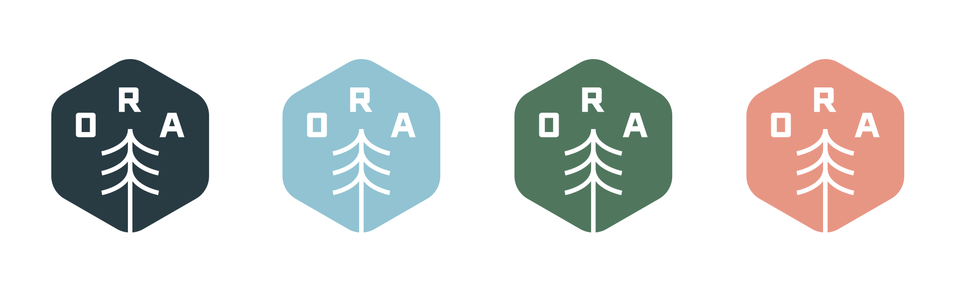
The color palette takes hues from the surrounding landscape and nature. Shades of Sky Blue resemble the sky and river, Forest Green from the surrounding plant-life, Salmon Pink and Tawny Gold from the soil.
LOGO AS SILHOUETTE FOR VIDEO / PHOTOGRAPHY
MAIN LOGO
SIMPLIFIED LOGO (FOR SMALL PLACEMENT / OBJECTS)
BRAND STYLING / COLORS
Secondary Brand Mark